 |
|
|
|
|
|
|
|
|
 |
|
|||||||
|
SysteMagicK - ButtonIt! Documentation Viewer
Button It! - Introduction Button It! - Button States and Bindings Button It! - Button Groups Button It! - Defining Styles Button It! - Layout Button It! - Registration Button It! - Saving Images Button It! - Style Presets Button It! - Support Button It! - Swapping Presets Button It! - Symbol Selector Button It! - Variations Defining StylesTo define the basic style of your buttons, you use the style editor. This is accessed via the 'Basic Style & Settings' tab on the main window:
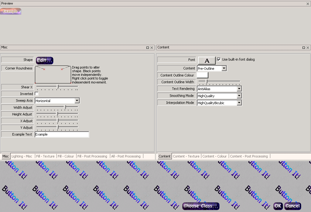
On pressing the edit button for the style, you are presented with the 'Style Editor' dialog, Editor' dialog, shown here: Style ClassesThe most important thing about a style is it's 'class'. This determines the general 'engine' that will be used for rendering. Different classes will have different different sets of parameters that indicate to the engine precisely how the button should be drawn. Some of these parameters are shared by all of the engines, some are shared between a subset of the engines, and some are unique to a single engine. To choose the button class, you click on the 'Choose Class...' button in the Style Editor. You are then presented with a list of the available classes, and a graphical depiction of a button rendered by each class. When choosing a class in this manner, you have the option of retaining whatever settings overlap between the old class and the new class. As an example, imagine if you have a style of class 'bevelled' with the colour set to orange, and you choose a new class of 'metallic'. Because 'metallic' also has a colour setting, if you check the 'retain previous settings' box, the new style will also have the colour set to 'orange'. Otherwise, the colour will be set to a default value that is determined by the metallic style (which is blue). Style SettingsHaving chosen the class, the 'Style Editor' is updated to reflect the settings that are available to the class. The Docking Window InterfaceThe settings are organised in groups that can be dragged to dock within each other (resulting in a 'tabbed' group, as shown in the figure above). They can also be dragged to 'float' within the style editor. To drag a 'lone' group or a complete tabbed group, click on the title bar of the group and drag it to the desired location; visual clues will be provided to help you determine where it will end up if you drop it in a particular place. To drag a single group within a tabbed group, drag the tab corresponding to the sub-group you want to drag. Right clicking the title bar of a group present a menu which allows you to hide or show groups as required. If you don't like the default layout of the properties, you can also save your preferred layout from this menu. A different layout can be saved for each button class; this will be the layout that will be loaded by default for that class in future. The default layout for each class generally contains settings related to the 'content' (i.e. the text or symbol within the button) in a docked tabbed group on the right, other aspects of the style in a docked tabbed group on the left, and one last group for the preview image, docked at the top. Most of the settings themselves should be reasonably self-explanatory. If in doubt, experiment! |
 |
|||||||
 |
 |
 |
 |
 |
 |
 |
|
|
 |
 |
|
||||||
 |
|
|||||||
