 |
|
|
|
|
|
|
|
|
 |
|
|||||||
|
SysteMagicK - ButtonIt! Documentation Viewer
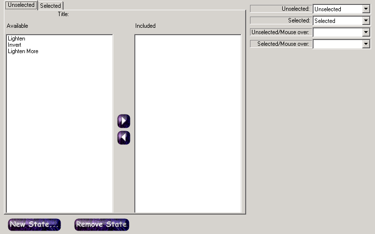
Button It! - Introduction Button It! - Button States and Bindings Button It! - Button Groups Button It! - Defining Styles Button It! - Layout Button It! - Registration Button It! - Saving Images Button It! - Style Presets Button It! - Support Button It! - Swapping Presets Button It! - Symbol Selector Button It! - Variations Button States and BindingsButton states and bindings are, appropriately enough, configured through the Button States and Bindings tab, which is depicted below:
A 'Button State' defines a particular form of a button. It comprises zero or more variations. For example, you might have a state representing the unselected image (containing no variations), and one representing the selected image when the mouse is over the button (perhaps with one variation that inverts the button, to represent it being selected, and another to change its colour, to represent it having the mouse over it). Default StatesBy default, a new project is created with four button states:
Initially, none of the states contain any variations, so they will all appear the same. If you do not need some of these states, you can remove them to prevent excess clutter on your disk when you save the images. You might also want to add states of your own (such as a 'disabled' version of a button). You must choose which variations you want to load before defining your bindings; you only get to choose from the set of loaded variations. BindingsBindings provide a mechanism for telling the layout which states correspond to the states it understands (the states it understands are the same as the default set of states, i.e. Unselected, Unselected Mouse Over, Selected and Selected Mouse Over). By default, the bindings are set so that each layout state corresponds to the appropriate button state. You can change these bindings using the drop down list boxes at the right of the Button States and Bindings tab. |
 |
|||||||
 |
 |
 |
 |
 |
 |
 |
|
|
 |
 |
|
||||||
 |
|
|||||||